Posts

Research

Leveraging big data to improve influenza surveillance system design

Every flu season, the U.S. Centers for Disease Control and Prevention (CDC) recruits roughly 3,000 physicians across the United States to report how many of their patients appear to have flu-like symptoms. These physicians form the core of the country’s sentinel surveillance system, a data source which is used to determine the geographic spread, timing, and severity of the influenza season nation-wide. While everyone acknowledges the importance of sentinel reporting, physicians are given few incentives to participate due to limited time and resources. My newest paper, which was recently published in PLoS Computational Biology, tackles the challenging question of how to improve targeting for sentinel physician recruitment by leveraging the high volume of aggregated medical claims data.

How can we improve sentinel site recruitment?

Compared to traditional sentinel surveillance, our medical claims data has reports from over 120,000 physicians and represents roughly 20% of all visits to health care providers during our study period. We found that our estimates of influenza disease burden and our inference about what drives the variation in its spatial distribution were most robust when the same sentinel locations reported data every year. Yet even with the best sentinel recruitment design, we observed that 10-30% of county-level estimates of disease burden were poor at the level of coverage at which the CDC collects U.S. outpatient influenza surveillance data. This means that surveillance practitioners should strive to recruit the same health care providers each flu season in order to get the most information out of the reported data.

What did we learn about influenza epidemiology?

The statistical surveillance model that we used to evaluate sentinel surveillance design also provided valuable insights about influenza epidemiology in the United States. During our study period of flu seasons from 2002-2003 through 2008-2009, we found that mid-Atlantic states had greater relative risk for influenza disease burden, and that socio-environmental factors, local population interactions, state-level health policies, and sampling and reporting levels contributed to the spatial patterns of disease.

Read the full paper:

Lee EC, Arab A, Goldlust SM, Viboud C, Grenfell BT, Bansal S (2018) Deploying digital health data to optimize influenza surveillance at national and local scales. PLoS Comput Biol 14(3): e1006020. https://doi.org/10.1371/journal.pcbi.1006020.

News

International Society for Disease Surveillance conference

In December 2016, I traveled down to Atlanta to present my work on the socioeconomic and measurement factors driving influenza disease burden in the United States. Thanks ISDS for putting on a great conference and presenting me with an award for outstanding student abstract! Conference abstracts are published at the Online Journal for Public Health Informatics — coming soon!

img_5809

Code, Research

Launching the flu severity index application

TL;DR version —

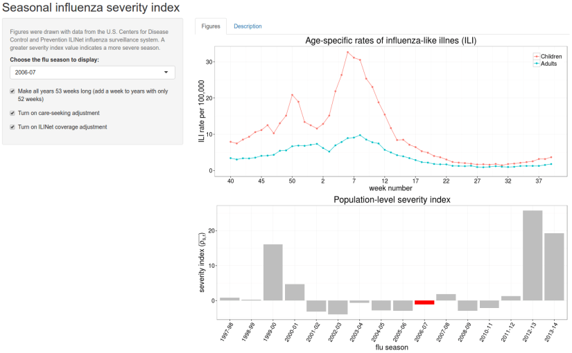
Click here to check out my new Shiny app, which displays the U.S. seasonal influenza severity index as calculated from Centers for Disease Control and Prevention ILINet data from 1997-98 to 2013-14.


My recent paper proposed new methods for quantifying seasonal influenza severity by looking at the relative risk of influenza-like illness between adults and children at varying points in the flu season in the United States. Don’t worry, this isn’t a repeat of my recent blog post on the paper itself.

As a proponent of open science, I had always been planning to post the code I had used to generate the data and figures that appear in the main manuscript. Due to the proprietary uses of the medical claims data, the primary data source in the paper, however, it was clear that we could not post any of the data itself. In these circumstances, I asked myself — why post code that wouldn’t add value beyond the findings of the paper?

As an alternative, I’m excited to announce the launch of a web application that displays the seasonal influenza severity index, as calculated with U.S. CDC’s ILINet data. These data are publicly available from CDC’s website through FluView Interactive, and I showed these results in the Supporting Material. The original analyses were conducted in Python, but I’ve developed the web application with the Shiny package in R (post to follow about that experience!).

Data from the 1997-98 to 2013-14 flu seasons are pre-loaded into the application. Users can use the drop-down menu to view two figures from a specific season: 1) adult and child ILI rates from week 40 (first week of October) to week 39 in the following year, and 2) the population-level severity index, as calculated according to the methods in the paper.

The goal of this web application is to make the results and “intuition” derived from the paper more accessible to researchers, policymakers, and the public. I hope to add features to the application in the future (e.g., ability for users to upload their own data), so suggestions are welcome!

Check out the seasonal influenza severity index application here!

sevixFluApp


Life as a Scientist

feedback on student presentations

Every year in the first weekend of February, the Georgetown Biology department hosts a Graduate Research Symposium. All second-year and above graduate students and postdocs are typically asked to present a 10 minute research talk. The purpose of the symposium is to showcase graduate student and postdoctoral research to current faculty and students and to prospective students visiting the department. Graduate students also organize the events of the day — from designing the schedule, to ordering the breakfast, lunch, and dinner, to creating a snazzy abstract booklet.

Our annual symposium was this past Saturday, and it was a huge success. Besides one small coffee emergency, everything ran smoothly. As one of the main organizers for this year’s event, we also chose to implement a new feature — a feedback form for the presenters. Four faculty members were anonymously assigned to review graduate student talks and other audience members were asked to review two talks per session (out of six) without assignment. Forms included questions about: 1) the presentation of research ideas (did you understand the… background, methods, figures, conclusions?), and 2) the presentation style (were the slides and oral presentation easy to follow?).

There was an average of 7-8 responses per presenter and 18 presenters. Presenters in the two morning sessions tended to get more feedback responses than presenters in the single afternoon session. Graduate students received many more responses than post-doctoral presenters.

It’s unclear whether the feedback will be useful. As a reviewer, I found it difficult to keep up with the evaluation and listen to the next presenter’s talk (even with a short 10 question form). We’ll likely shorten the survey to one page and leave a single open comment section at the bottom, in order to improve the quality of feedback.

I’m curious to hear whether other departments implement a feedback system for graduate student talks. We’re a broad audience and few labs are “in the same field”. Does this detract from the quality of the feedback we can receive from our colleagues?

For those interested, a copy of the feedback form we used at the symposium is below.

Georgetown Biology GRS 2016 – presenter feedback form


News, Research

Novel indexes for estimating population-level flu severity

I know one great way to start off the new year — Check out my new paper on “Detecting signals of seasonal influenza severity through age dynamics” in BMC Infectious Diseases!

What is this paper about?

Typically, when we think about severity in the context of epidemiology, we ask: “Of all of the people who have this condition, how many or them died or were hospitalized by its symptoms?” These measures, also known as the case-fatality or case-hospitalization risks, are standard ways of quantifying the severity magnitude of a disease.

Unfortunately, it’s really challenging to estimate how many people get influenza every year and only a small subset of the population gets ill enough to die or become hospitalized.

  1. At the population-level, we can only observe the sick individuals that report their illness in some way (e.g., those that visit the doctor, buy drugs to combat flu, call in sick for school or work, or complain about symptoms on social media). It’s possible that all individuals with symptoms might be captured across multiple data sources, but how do you combine information from hospitals, drug companies, and Twitter in a meaningful way?
  2. Many flu cases are asymptomatic — people themselves may not even know that they are sick. These asymptomatic individuals can still transmit the virus to others — some immune systems might be strong enough to fight off the virus without generating symptoms, but people receiving the infection from asymptomatic individuals can still end up feeling crummy.
  3. We don’t usually test for flu among individuals that go to the doctor. In most cases, identifying the specific virus that is causing your symptoms won’t change the treatments they will prescribe, so it’s not often useful to confirm that influenza virus is the source of illness. They’ll prescribe you general antiviral drugs and send you back home for bed rest.
  4. The elderly and young toddlers are most at risk for mortality and hospitalization. Functionally, existing flu severity metrics focus only on the outcomes of these two age groups.

How can we capture information about the severity of a flu outbreak with fewer data sources and for a greater portion of the population?

In this paper, we use routinely available flu surveillance data to identify age patterns among working-aged adults and school-aged children in “influenza-like illness cases” (unconfirmed sick cases that look like they could be flu) that are consistent across multiple flu seasons in the United States. We use these observed age patterns to create a new severity index; this index has some demonstrated capacity to detect severity early on in the flu season. We compare this new index to other quantitative severity benchmarks and examine data at the level of the entire U.S. and across different states. Public health officials may be able to use these measures to inform communication strategies during the course of an outbreak.

Bottom line: We suggest that it may be possible to use the relative risk of influenza-like illness between adults and children in imperfectly sampled data sources to estimate flu severity in the entire population.

Click here to read more!

We will be posting the code for these analyses on Bansal Lab Github in the coming weeks. Stay tuned for details!

News

WIPS & NIH big data meeting

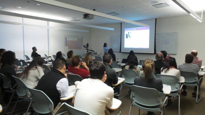
11/14/15: Thanks for attending my Work-in-Progress research talk at the Biology department! Great questions and feedback on my new project.

2015_11_14


11/9/15: I’ll be presenting my poster on “Examining the drivers of spatial heterogeneity in influenza disease burden with high resolution medical claims data” at the upcoming NIH meeting on big data in infectious disease research. Hope to see you there next week!

Life as a Scientist

Beamer for presentations

Update 11/10/15 evening:

On a related note, I came across this post on preparing scientific posters in LaTeX. It seems that there are packages (TikZ, for instance) allowing you to create graphics directly in TeX too. I recently had the opportunity to make a scientific poster, so maybe I’ll write another post about that experience. (I did it in PowerPoint and there were some technical difficulties!)


I am planning to come back to my examples with the R dplyr package in the next post, but I wanted to discuss the use of Beamer and LaTeX to make scientific presentations. I am preparing for my yearly Work-in-Progress seminar in the Biology department this week and I have been making my 45 minute presentation in Beamer. I was reflecting earlier this week on some of the pros and cons of using Beamer.

Background (aside): I’ve used Beamer for all of my previous formal seminars, but I typically use the Google Drive app, Google Slides, for informal talks at lab meeting or journal club. I have also used Prezi for class lectures and class presentations. I kicked off my graduate seminar career with Beamer because I thought it would be a good opportunity to play with LaTeX and learn a new skill and I’ve continued at it since then. My presentations are not particularly filled with mathematical notation, so LaTeX only benefits me minimally in this regard.

Pros:

  • creates presentations that are visually compelling
  • easy to replace layouts that can completely change your presentation in seconds
  • simple, pre-specified formatting that can be applied with commands
  • copying and pasting slides or specific content between presentations is simple since it is mostly independent of broader formatting choices
  • relatively simple insertion and copying of mathematical notation — you can even turn specific terms into commands that may be easily called in multiple places in the file.
  • you can turn your presentation into a document draft or slide handout with changes to a few words (with \documentclass)

Cons:

  • must be compiled, which takes additional time when creating and formatting content
  • figures must be kept in a central location or copied with every Beamer presentation since the files are not embedded (as in PPT)
  • formatting is fussy –> I know LaTeX typesetting is supposed to make things easier, but it’s tricky to make a slide look nice with multiple figures and text blocks without some manual formatting (If someone else knows how to do this, please let me know!)

Verdict: I would not recommend the use of Beamer for everyone or for all occasions. If you want to make a quick and dirty presentation, use PowerPoint or Google Slides for the WYSIWYG interface because it’s easier to move figures around and add bubbles or text boxes in specific places. If you are going to reuse content a lot and incorporate lots of mathematical but want to have some flexibility with background layouts and color schemes, Beamer might be a nice option. These features could benefit professors that reuse slides in various courses or for different lecture topics.

Other alternatives:

  • I’ve used Lyx software for writing TeX documents, which has some nice WYSIWYG  software features but preserves the transportability by providing underlying TeX code. I would be curious to know whether this interfaces works similarly well for making presentations.
  • I briefly mentioned my use of Prezi earlier in my aside. Prezi can make attractive, dynamic visual presentations and enables the “intuitive” spatial organization of presentation concepts. I used the web version of the tool and I found the interface to be a little clunky. It took a long time for me to create lectures because I needed to create a mental concept map of the presentation before putting any of it on the page. It is, however, great for visual learners and keeping the attention of antsy students.

I’m no expert, so I am hoping to try out some new presentation tools next time I give a talk.

Additional Beamer resources: